MURAL is different from other collaboration and documentation software. It has what’s called a "zooming user interface" (ZUI).
Think of it more like Google Maps than working in a document or presentation. You move in and out of the content you map in a mural.
In other words, you can change the scale of what you’re viewing: zoom in to see the detail, zoom out to get the big picture.
ZOOMING AND PANNING
First, learn how to zoom and pan quickly and comfortably - you’ll be doing a lot of it! Interacting with content on a mural typically requires changing your view frequently.
We recommend using one of two modes to zoom and pan with your computer hardware. In trackpad mode you can use your laptop’s trackpad to pan with two fingers and zoom by pinching. In mouse mode, you zoom with the scroll wheel and pan by dragging the mural background.
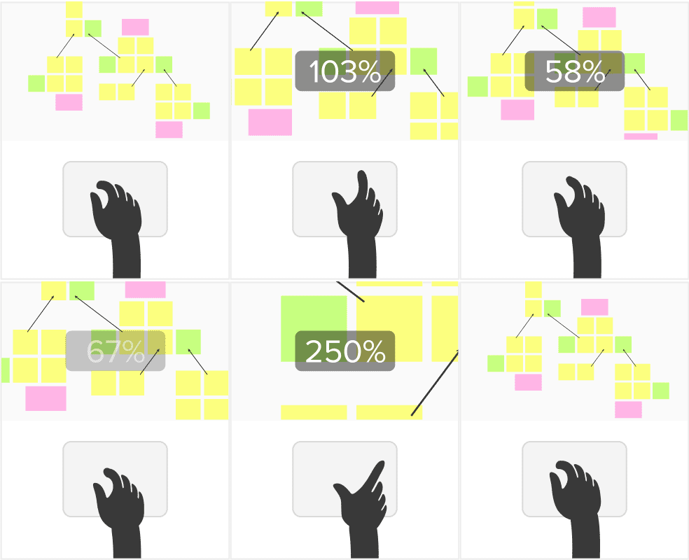
.
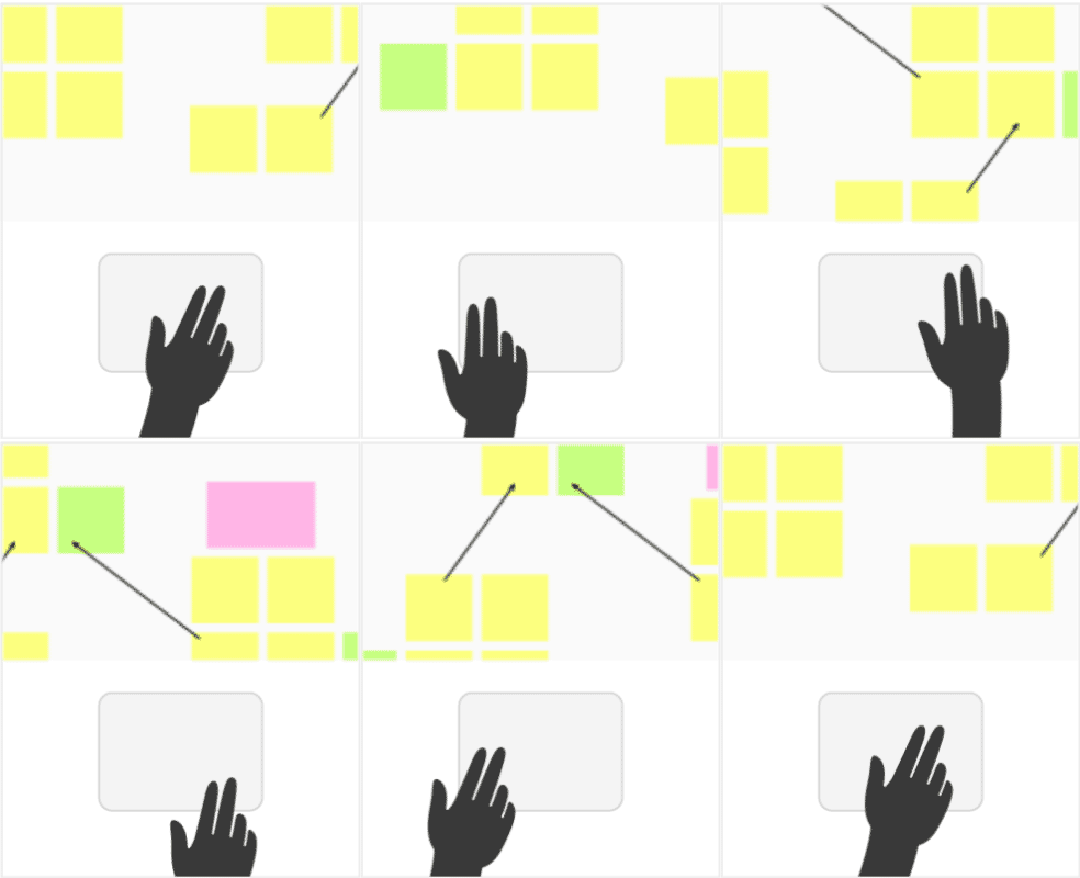
Find out more about zooming and panning here. Be sure to practice and become comfortable moving in and out.
UNDERSTANDING SCALE
Second, consider the scale you’re working at. We recommend working around the default sticky note size. If the text on a sticky note is too small to read, zoom in. If it’s too large, zoom out.
Avoid re-sizing sticky notes!
From the starting point of the default sticky note size as your initial reference, this gives rise to 4 different levels of viewing and working in a mural.
1. OVERVIEW LEVEL
The overview scale is when you’re zoomed all the way out and you can see the entire mural at once. This is about a 10%-13% zoom level.
At this scale you should be able to orient yourself to the different parts of a mural. If there is a header at the top, it should be large enough to read. Subsection headers should be smaller, but also readable at the overview level.
In other words, set up the mural with a hierarchy of text sizes so there is also content that is readable, even when zoomed all the way out.
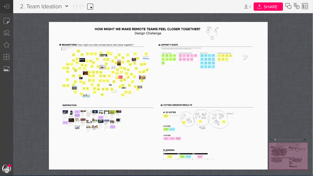
Note that the at the Overview Level, you're headers may feel very large. That's fine. In fact, it's better to exaggerate the the size of the main headers than have them too small. The normal rules of hierarchy in typography don't apply here directly.
2. SECTION LEVEL
When zoomed into about 33%-50% you can see about about a quarter of the mural - just one section of it. At this level the main mural header will appear large. That’s OK.
The subsection headers should be at a size that is comfortable to read, and you should be able to orient yourself to smaller texts like and area title or framework title.
However, even at this level you probably won’t be able to read text on a sticky note at the default size.
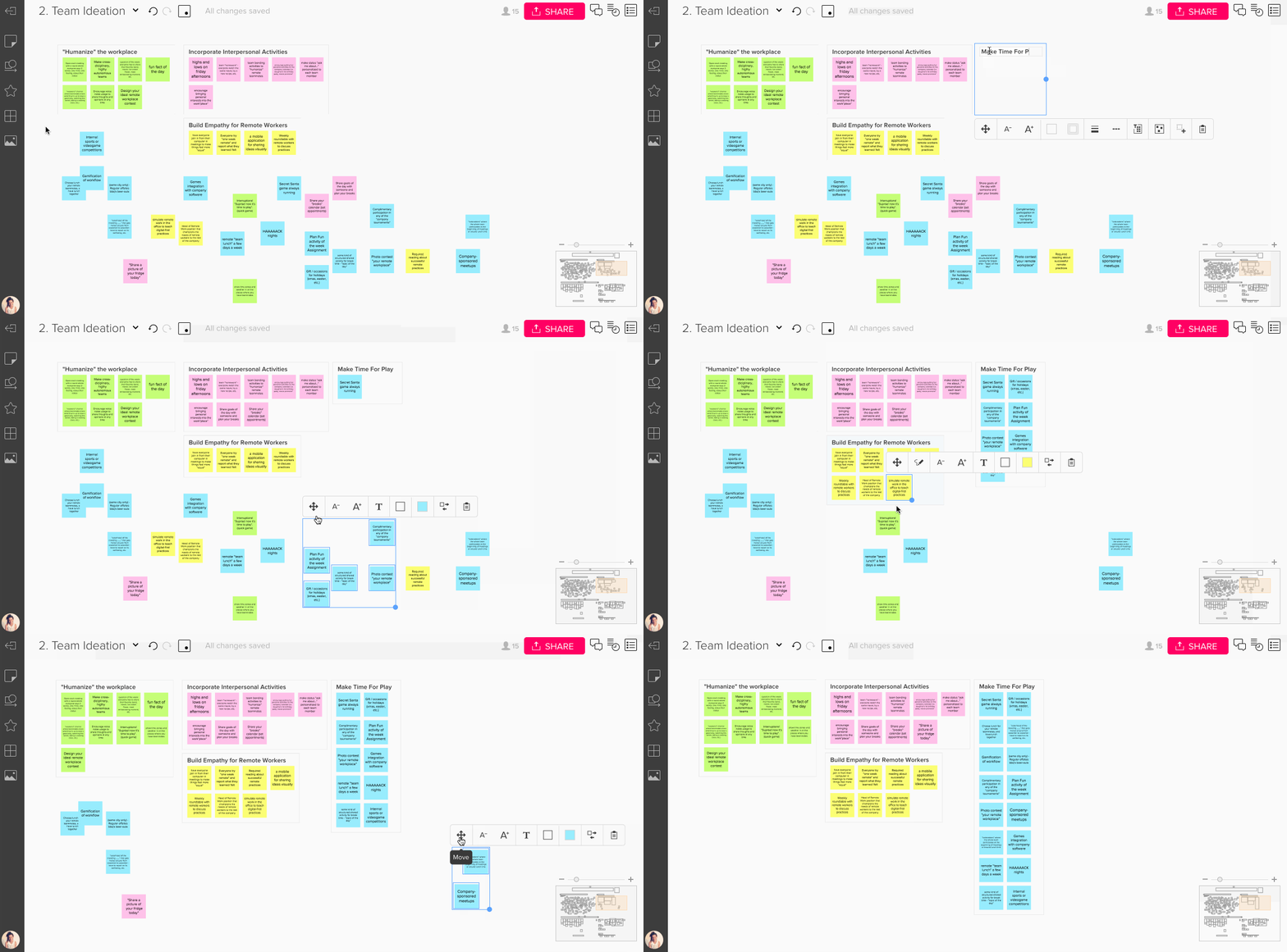
3. WORKING LEVEL
The working level is where you’ll spend most of your time while adding content to a mural. This is at a zoom level of about 67%-100%. Reading text on a sticky should be no problem at this scale.
Note that at the working level you’ll only see a small portion of the overall mural. Use the mini-screen in the lower right to see where you are on the mural. The transparent colored box within the mini-screen shows your view on the mural.
(BTW, you can even navigate with the mini-screen. Just grab the transparent colored box and move it around to pan the mural).
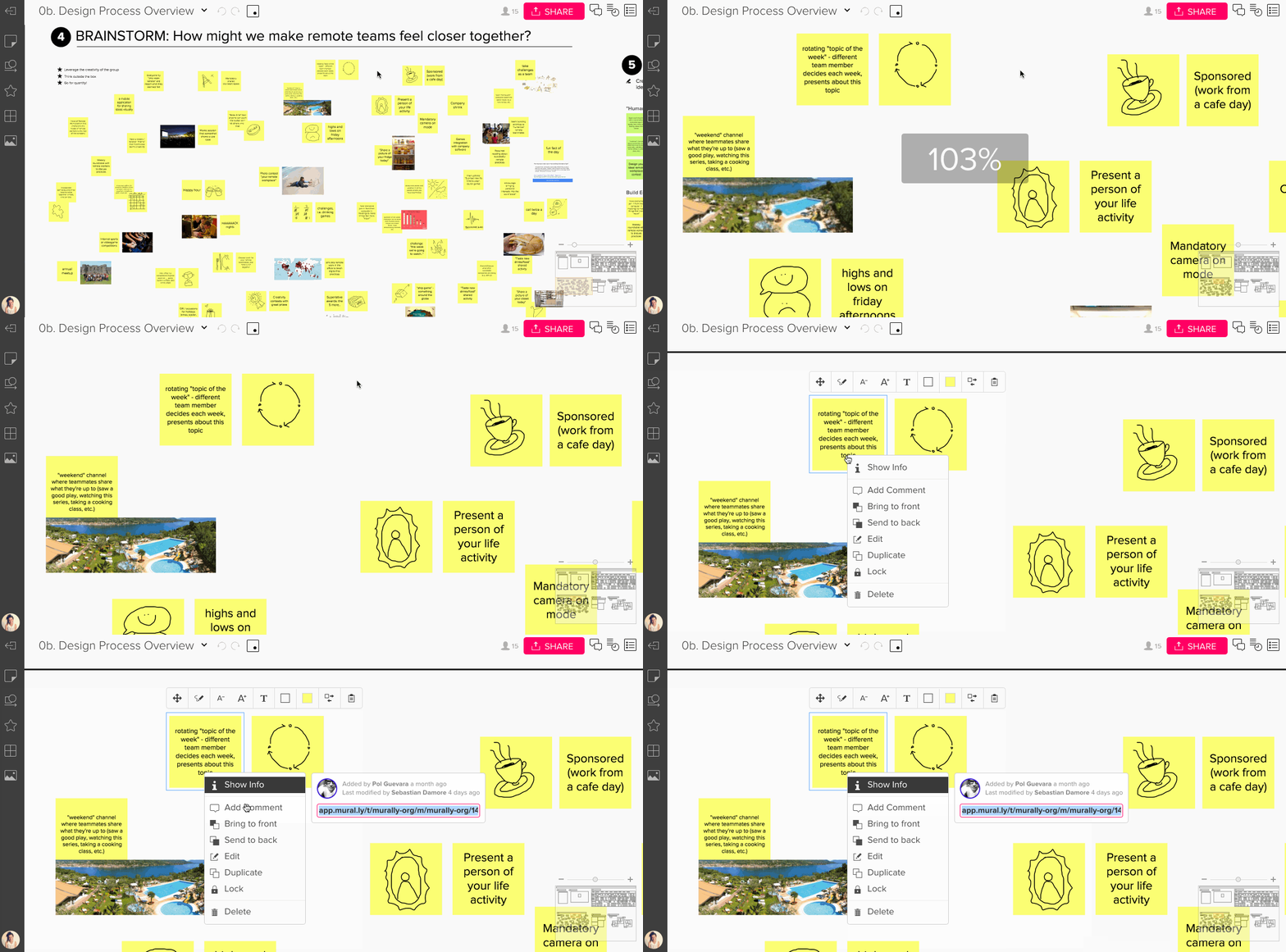
4. CLOSE-UP
As the name suggests, the close-up level is when you are zoomed all the way at 150%-200%. This is great for viewing the detail of images, which are rendered at high resolution in MURAL.
Typically text on sticky notes will be too large at the close-up scale, and it’s not that common that you’ll be zoomed all at the way - at least not for a long a time.
YOUR ONLINE WHITEBOARD
MURAL is a large online space you can map all kinds of content too. Think of it like a digital board or canvas or, as the name “MURAL” suggests, a large wall.
To give you a sense of space on a small screen, like a laptop, you’ll have to move around frequently. Zooming and panning are an integral part of the MURAL experience.
Learn how to zoom and pan quickly, and think about the scale you’re working at. Again, don’t make sticky notes larger - that will take more of your time and reduce the amount of space you have.
Instead, move and in out as needed to work at different scale levels:
- OVERVIEW: A view of the entire mural
- SECTION LEVEL: Zoomed into about a quarter of mural
- WORKING LEVEL: The scale you’ll be working at to add and read content
- CLOSE-UP: Zoomed all the way in to see the detail
LEARN MORE
- "Creating Templates in MURAL" webinar by Jim Kalbach
- Zooming and panning in mural from our support site
Or join our weekly webinars for a demo of MURAL to get started quickly.


